Grocedy
Product
Shopping, Subscription-based
Skills
UI/UX Design, Product Design, User Research, Design Systems, Prototyping
Platform
Mobile App (iOS & Android), Web
Tools
Figma, Framer
Date/Timeline
December 2021
VIEW LIVE
Summary
Grocedy is a modern mobile application designed to bridge the gap between local organic farmers, trusted grocery suppliers, and urban consumers. The app focuses on delivering fresh produce and everyday grocery essentials with a seamless, user-centric interface. The goal was to create a digital experience that feels as fresh and organic as the products being sold, prioritising ease of navigation, quick checkout, and flexible membership plans.
The Problem
Urban professionals often struggle to access fresh, organic produce and quality grocery staples due to busy schedules and the inconvenience of traditional markets. While many grocery delivery apps exist, they often suffer from:
Cluttered interfaces that make decision-making difficult and overwhelm the user.
Hidden fees and complex delivery structures that erode trust.
A lack of transparency regarding product sourcing.
Generic visual designs that fail to evoke the feeling of "freshness" and quality.
The Solution
We designed Grocedy to be an "authentic products-to-Phone" experience, covering everything from farm-fresh vegetables to pantry staples. By utilising a vibrant, nature-inspired colour palette and a "sticky" navigation system, we ensured that the user journey—from onboarding to checkout—is intuitive and delightful.
Key Solutions:
Simplified Onboarding: A visually engaging walkthrough that highlights value propositions immediately.
Unified Auth Flow: Login and Signup screens that reduce friction and cognitive load.
Visual Discovery: A card-based home screen that puts product imagery front and centre.
Transparent Pricing: A dedicated "Buy" tab that clearly outlines buying options and membership benefits without hidden costs.
Design System & Visual Identity
Color Palette
The primary colour is Emerald Green, chosen to symbolise nature, freshness, and health.
Primary: Emerald Green (
#558223) – Used for CTAs, active states, and branding.Secondary: Lime Green (
#84CC16) – Used for accents and background blobs.Neutral: Slate (
#001122) – Used for text to ensure high readability.Background: Off-White (
#F8FAFC) – Reduces eye strain compared to pure white.
Typography
We selected a clean, geometric Sans-Serif typeface, Montserrat.
Headings: Bold and tight tracking for a modern, impactful feel.
Body: Regular weight with generous line height for readability on small screens.
Iconography
Rounded, outline-style icons (Lucide/Feather style) were used to maintain a friendly and approachable aesthetic.
Screen Breakdown & User Flow
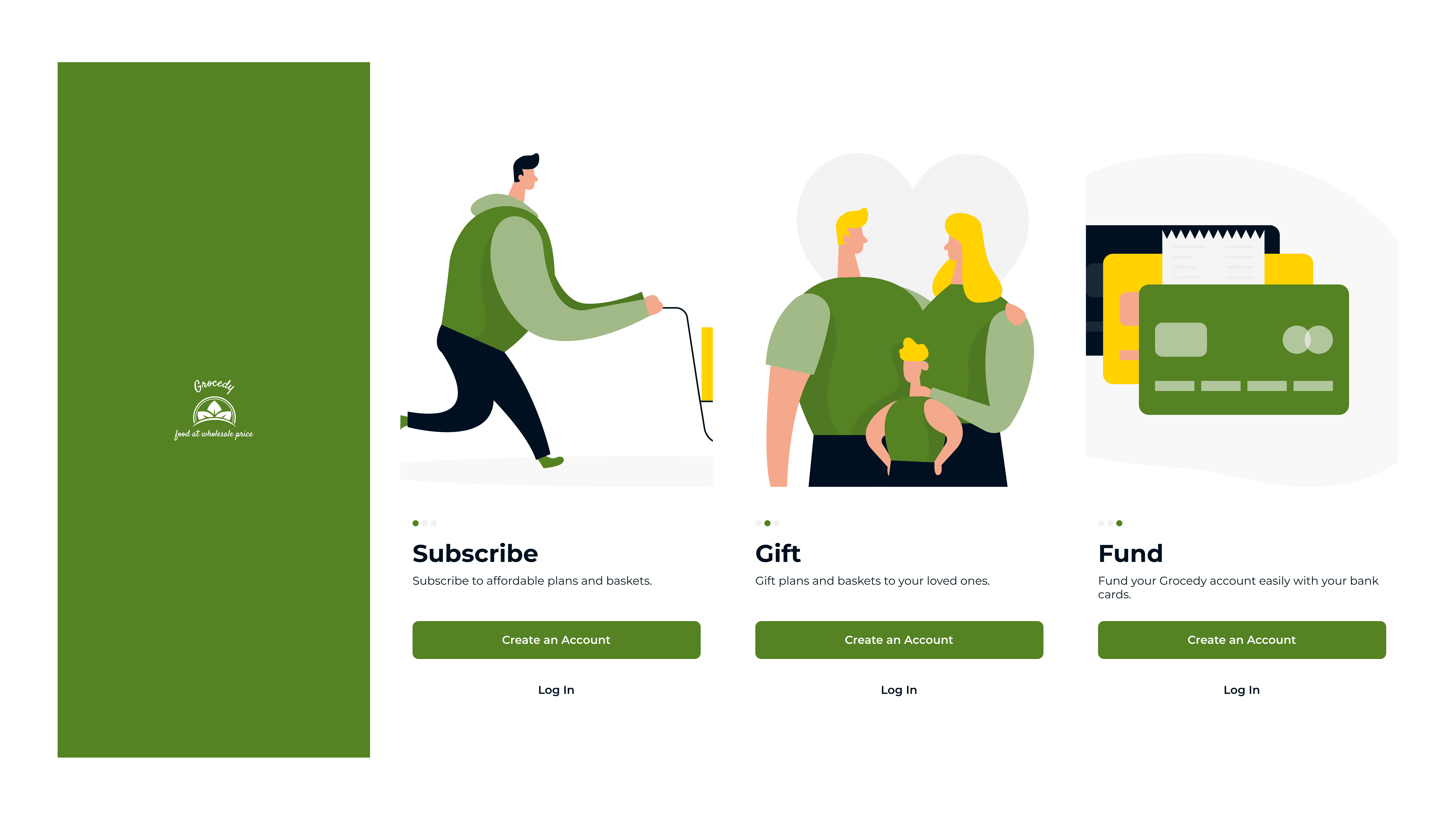
A. Splash & Onboarding
Goal: Captivate the user immediately and explain the app's value propositions clearly.
Design: A clean splash screen with the logo transitions into a 3-step carousel illustrating the core benefits:
Subscribe: Select a flexible subscription plan that fits your lifestyle and grocery needs.
Gift: Easily send fresh produce and grocery bundles to friends and family.
Fund: Securely fund your wallet for a seamless and budget-friendly shopping experience.
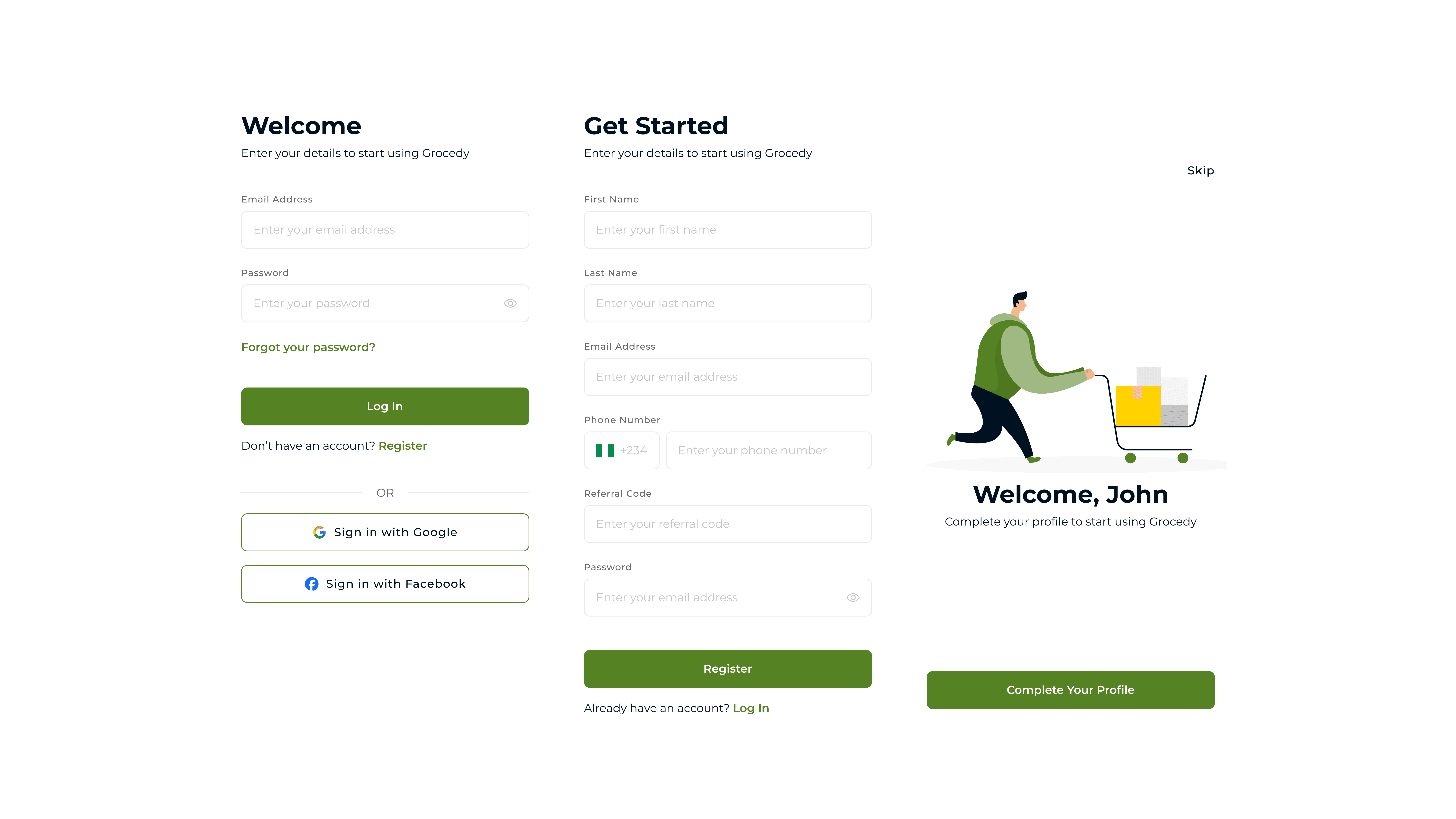
B. Authentication (Login & Sign Up)
Goal: Lower the barrier to entry and reduce friction during entry.
Design: "Sign In" and "Sign Up" screens with integrated social sign-in options.
Contextual Messaging: The header dynamically changes from "Welcome!" (Login) to "Get Started" (Sign Up) to guide the user.
Social Integration: Prominent Google and Facebook options are provided under a clear "Or continue with" divider to offer one-tap access.
C. Home Screen
Goal: Facilitate quick discovery and purchase with a clear hierarchy and easy access to different buying modes.
Contextual Header:
Easy Access: Users can easily switch tabs to view buying options or to view their orders, keeping their primary goals one tap away.
Status Updates: A bell icon with a notification badge alerts users to order updates or offers without cluttering the main view.
Featured Section:
This area utilises engaging cards to show users current promotions, new product bundles, and time-sensitive discounts on both fresh produce and packaged goods.
Buy Section:
This section showcases the different buying options available on Grocedy. Users can choose to buy bundles, gift bundles to others, or create subscription plans.
Product Card Anatomy:
Imagery: Large, high-quality thumbnails take center stage to appeal to the user's appetite.
Key Info: Clear pricing, unit measurement (e.g., "1 kg"), and star ratings help users make informed decisions quickly.
Actions: A direct "Add to Cart" button (
+) and a "View Item" action enables quick interactions.
Global Navigation:
The bottom tab bar provides persistent access to Home, Wallet, Buy, Alert, and Settings, serving as the app's primary anchor.
The top navigation bar shows the page title and grants access to the cart and order history.

D. Membership Plans
Goal: Upsell premium features transparently and effectively.
Design: A clear, card-based comparison view featuring distinct membership tiers (Basic, Gold, Silver, Diamond, Platinum).
Plan Hierarchy: Plans are vertically aligned from cheapest to highest, allowing users to compare benefits as they scroll down the list easily.

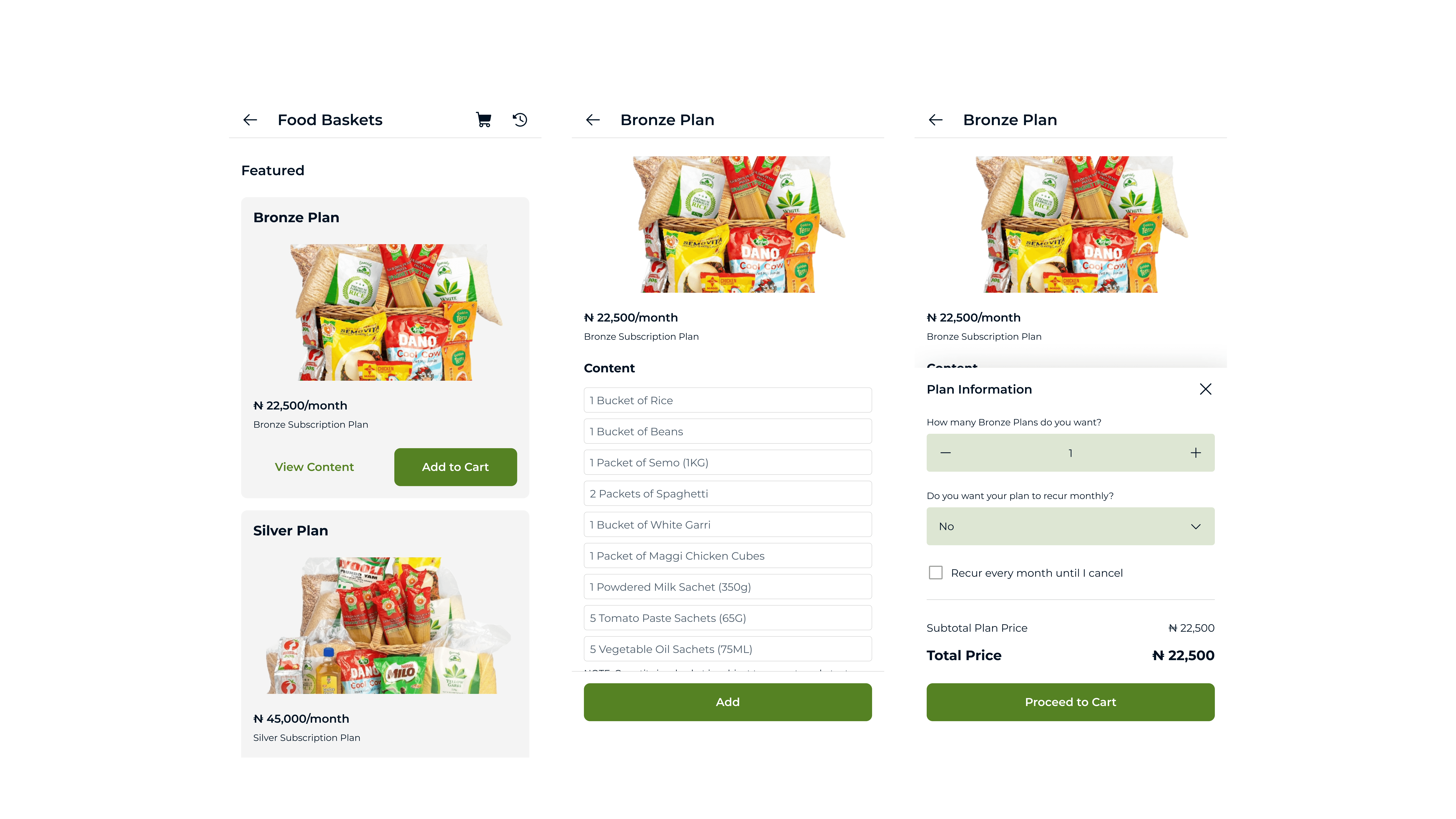
E. Food Basket & Checkout
Goal: Streamline the purchase process and reduce cart abandonment.
Product Grid: Items are displayed in a clean 1-column grid. Each product card features a high-quality image, price, and a direct "Add to Cart" button, facilitating rapid selection without navigating to a separate details page.
Cart Management: The dedicated "My Cart" screen presents selected items in a clear vertical list. Users can easily adjust quantities using intuitive
+and-stepper controls or remove items entirely.Cost Transparency: The cart summary provides an immediate view of the subtotal. The primary "Checkout" button is prominent and displays the final total price, ensuring users are fully aware of the cost before proceeding to payment.
F. Profile & Settings
Goal: Provide a centralised hub for account management and personalisation.
Comprehensive Menu: A clean, vertical list of options gives users easy access to essential settings:
Personal Information: For updating contact details and profile imagery.
My Membership: A direct link to view or upgrade their subscription plan (as detailed in the Membership Plans section).
Payment Methods & Addresses: For managing saved cards and delivery locations.
To Do: A personalised section for customising alerts and accessing saved/wishlisted items.
Change Password and PIN: Secure settings for general app preferences and account security.
Logout Action: A distinct "Log Out" button is placed at the bottom of the list, using a contrasting colour (red) to differentiate it from navigation items and prevent accidental clicks.

Challenges & Iterations
Buying Options & Membership Discovery
Issue: Initial user testing revealed that the specific "Buy" options (bundles, gifting) and membership tiers were difficult to locate, as they were initially buried within the profile settings or mixed into the general feed.
Iteration: We elevated the importance of these core features by adding a dedicated "Buy" tab to the main bottom navigation bar (represented by a prominent icon). We also added direct "Buy" sections within the home screen's buying options, creating multiple intuitive entry points to the purchasing flows.
Results & Conclusion
The final high-fidelity prototype showcases a cohesive and user-friendly grocery shopping experience. The use of consistent branding elements and standard mobile patterns (bottom navigation, sticky footers) ensures a low learning curve for new users.
Success Metrics
Since the implementation of the redesign and the optimised "Buy" flow:
Downloads: The app has achieved 5,000+ downloads across app stores.
Engagement: User retention has improved by 35%, attributed to the simplified onboarding and sign up process.


