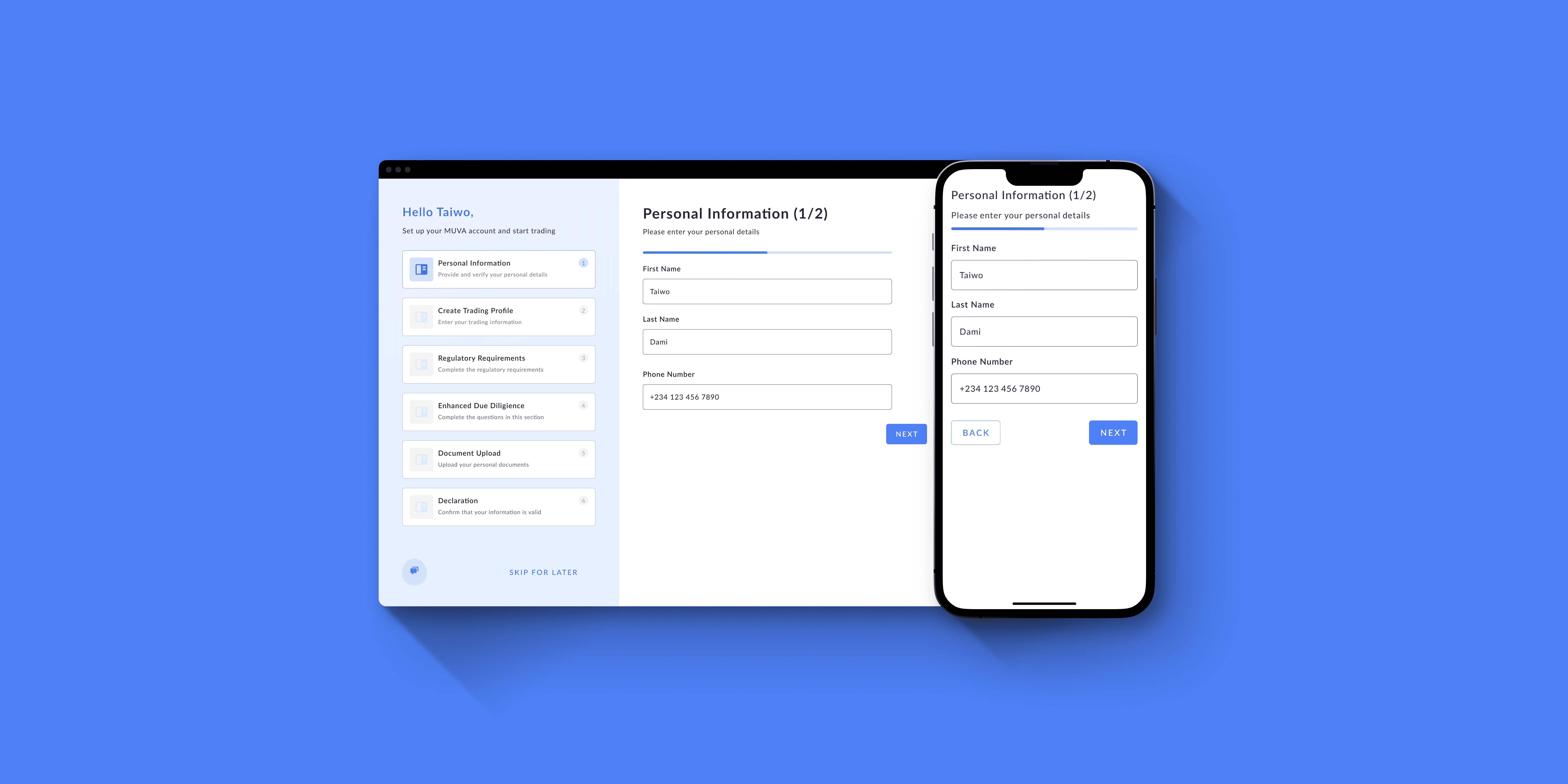
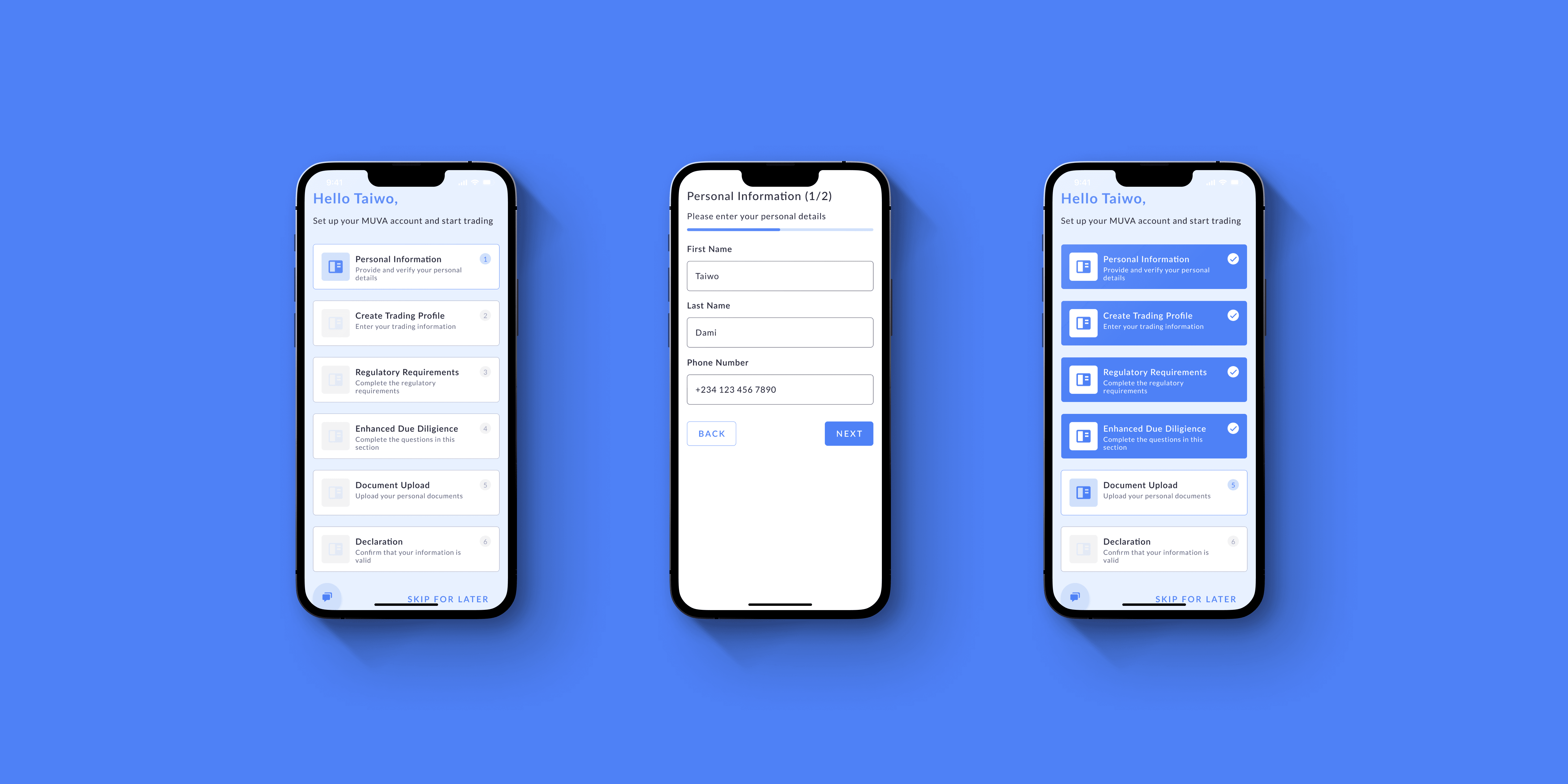
Mobile and Desktop
Muva, a crypto trading platform, was experiencing difficulties with new user onboarding. Users found the initial setup process convoluted and confusing, leading to a significant drop-off rate during the onboarding phase. The process was not intuitive and required users to navigate through multiple screens, causing frustration and resulting in potential traders abandoning the process before completion.
Additionally, users struggled to understand some of the trading terminology and platform-specific features, creating a barrier to entry for novice traders. This was a critical issue as it affected user retention rates and the overall growth of the platform.
As a UX Designer, I took the lead on redesigning the onboarding process. The primary objective was to create an intuitive and seamless process to guide users efficiently through the platform's setup.
Firstly, user research was conducted to understand the challenges that new users were experiencing. This included interviews with current users and surveys. The findings helped in identifying the primary pain points in the current onboarding flow.
The information architecture of the onboarding process was then redesigned. Instead of overwhelming users with numerous screens at once, we introduced a step-by-step guide that broke down the process into manageable sections. This was supplemented with clear and concise instructions on each page.
Throughout the redesign, I collaborated with cross-functional teams to ensure that the updated onboarding process would not only be more user-friendly but also align with the technical capabilities of the platform.
After implementing the new onboarding flow, Muva saw a significant reduction in user drop-off rates during the onboarding process. User feedback indicated that the redesigned process was more intuitive, informative, and less overwhelming.
Usability tests showed that new users could complete the onboarding process with fewer errors and in less time. Moreover, customer service inquiries related to onboarding issues decreased, signifying that users were finding the new process more manageable.
Overall, the redesigned onboarding flow for Muva improved user experience, increased user retention rates, and created a solid foundation for users to effectively use and navigate the platform, contributing to Muva's mission of providing a seamless trading experience.


