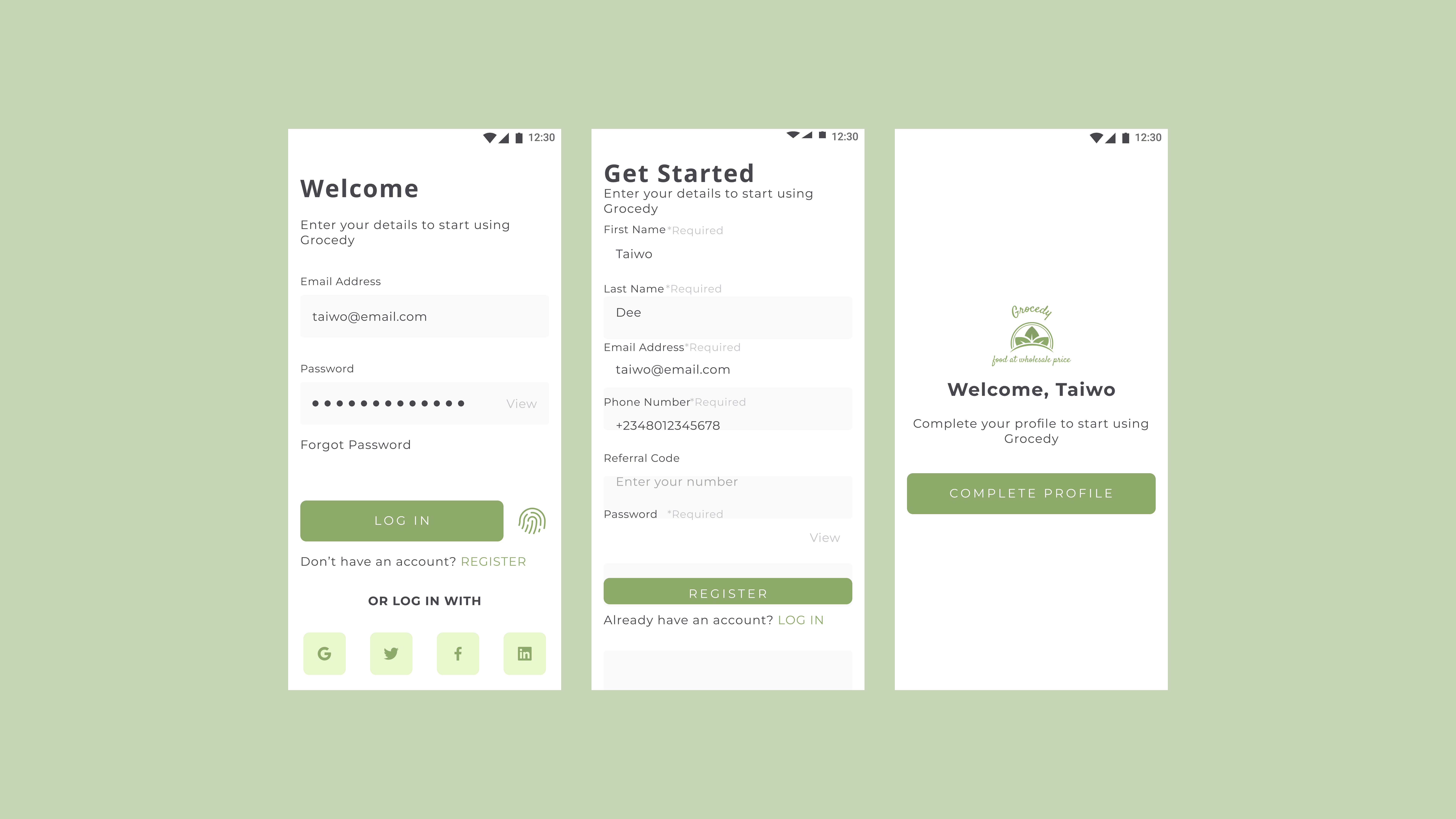
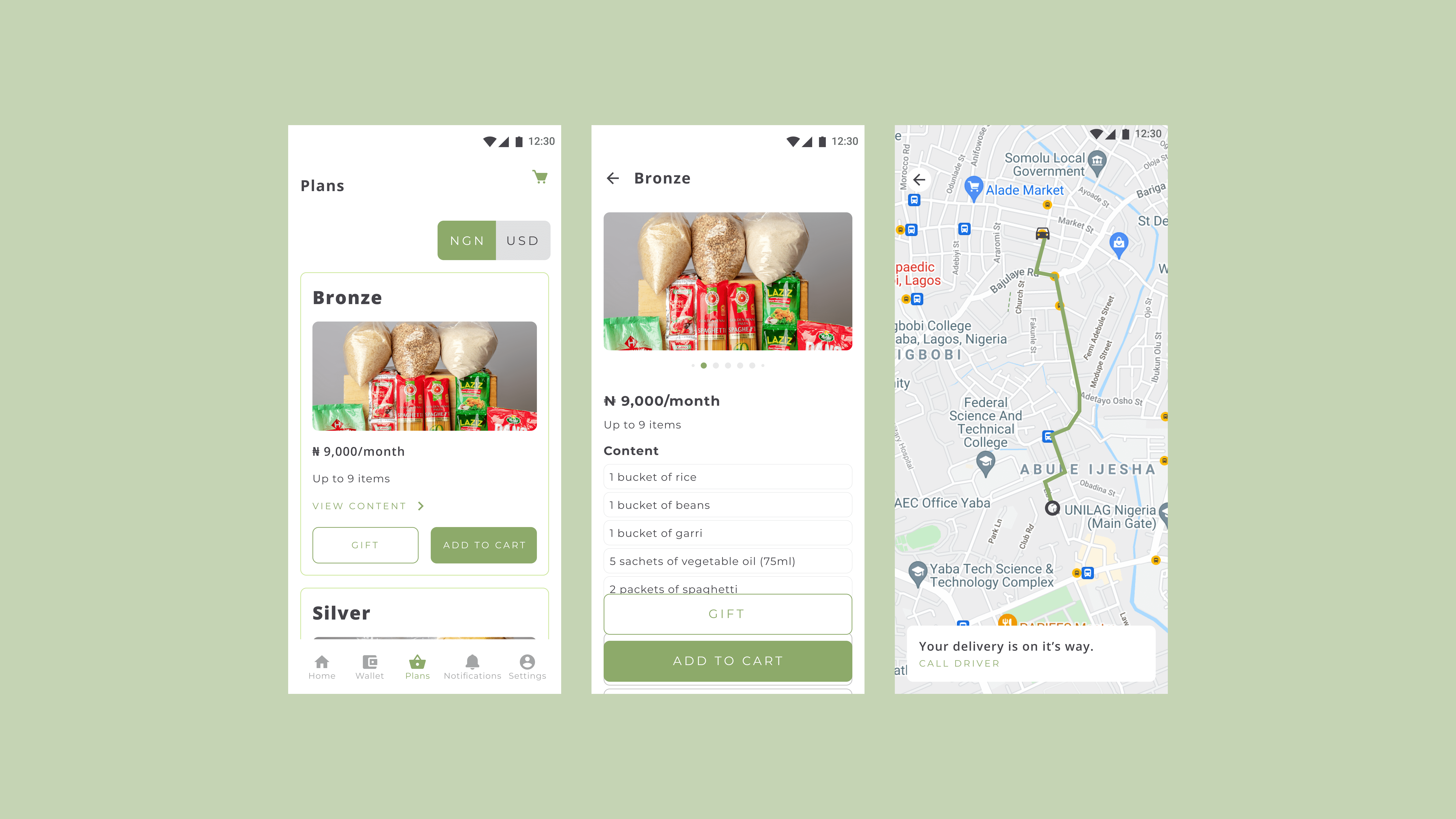
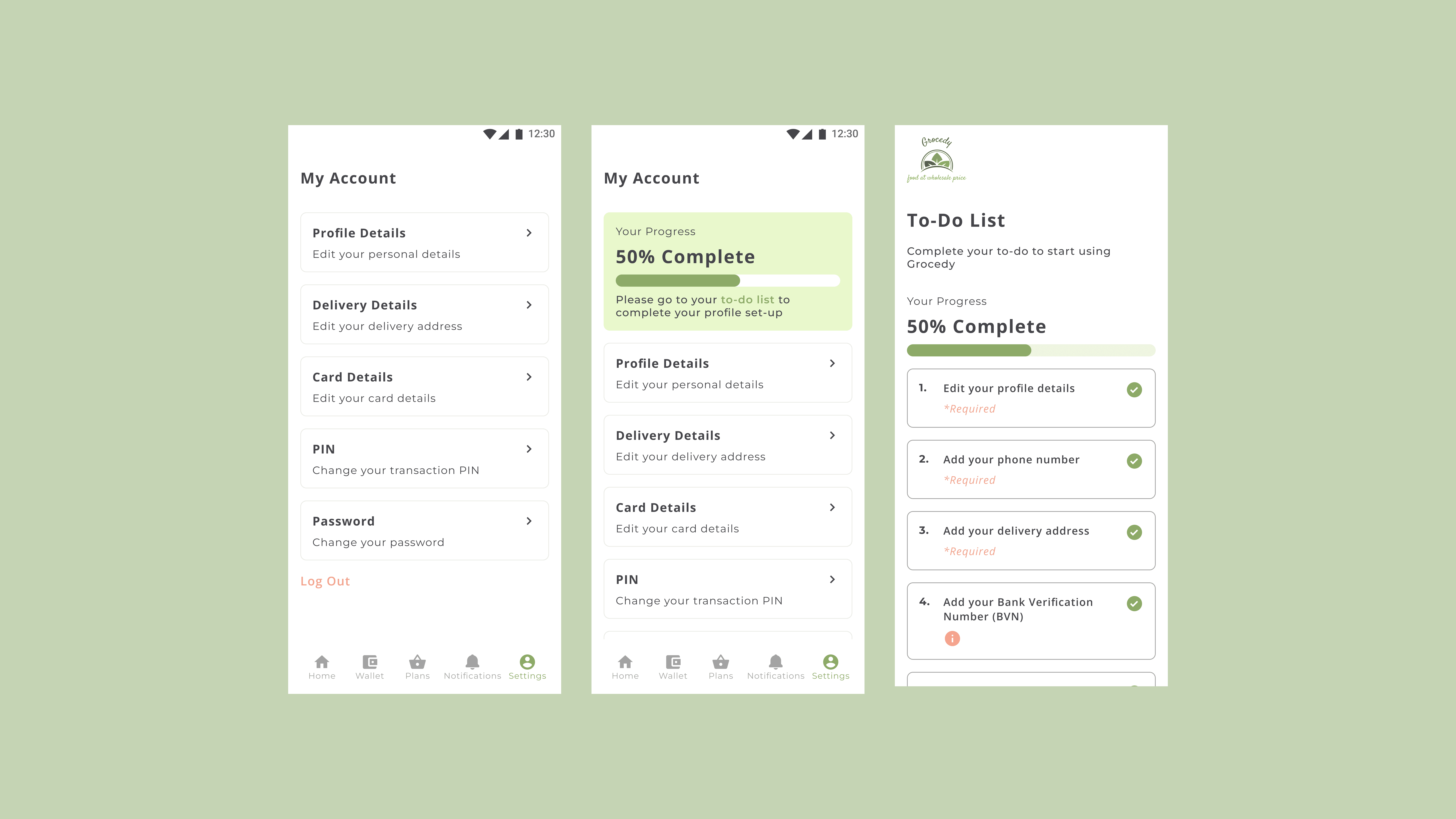
With the exponential rise in e-commerce, the Nigerian grocery sector has witnessed a significant shift in consumer behavior. More and more individuals are now turning to online platforms for their daily grocery needs. Grocedy, with its unique business model and value proposition, entered this bustling market aiming to simplify the grocery shopping experience.
The primary goal was to create an intuitive, streamlined, and hassle-free user experience for Grocedy users, which not only enables easy shopping but also offers other services like bill payments and mobile top-ups.
Trustworthiness: As a new platform, gaining the trust of users to make financial transactions, like bill payments and mobile top-ups, was crucial.
Seamless Integration: Ensuring the bulk-buying process, where funds from multiple users are merged, is transparent and easy to understand for the users.
Information Overload: With a range of offerings beyond just groceries, presenting everything without overwhelming the user was a challenge.
User Research: I conducted surveys and one-on-one interviews to understand the pain points of online grocery shoppers.
Information Architecture: I categorized Grocedy's vast offerings in a hierarchical manner, ensuring that the most important features were easily accessible.
Wireframes and Prototypes: I designed wireframes and interactive prototypes to visualize and test the user journey within the app.
Feedback Iteration: After initial designs, I gathered feedback from potential users and made necessary refinements.
Final Design: I ensured that the interface was not only functional but also aesthetically pleasing, maintaining a consistent brand identity throughout.
Higher Conversion Rates: The intuitive UX led to a significant increase in user conversions, both for grocery shopping and other services.
Trustworthiness: Clear communication about the bulk-buying process and secure payment gateways increased user trust.
Positive Feedback: Users appreciated the simplicity and speed of the platform, which reflected in positive reviews and ratings.
Grocedy showcases how a well-thought-out UX/UI design can play a pivotal role in the success of a digital platform. Through a keen understanding of the users' needs and meticulous design iterations, Grocedy managed to stand out in a competitive market and offer unmatched value to its customers.
DOWNLOAD THE MOBILE APP


